Content Strategy: HealthReach
The Problem
HealthReach Community Health Centers (known as HealthReach or HRCHC) is a Federally Qualified Health Center with 12 locations that serves low-income patients across rural Maine. Their mission statement is “to provide high-quality, affordable, patient-centered healthcare in the medically underserved communities of Central and Western Maine.”
HealthReach had requested a flexible, informative, responsive, secure, up-to-date website that is easy to maintain and is comfortably viewed across desktop and mobile devices. In addition, they are seeking a design partner that provides tools for search engine optimization (SEO) and content sharing across major social media platforms.
During the COVID-19 Pandemic, HealthReach was forced to switch to a mostly-virtual platform for the time being. Elements needed for remote healthcare are not compatible with HealthReach’s current website. An upgrade to our current website is needed to enable HealthReach health centers to provide the tools our patients need to navigate and access critical functions and information needed for successful (healthy) patient outcomes.
Process
To start HealthReach’s complete content rebrand, I started with an analysis of their current platforms/web design. Some of the problems included duplicate page titles, lack of meta-descriptions, missing H1 and H2 elements, contrast errors, inactive social media accounts, inconsistent fonts, and bland imaging.


I then ran a competitive analysis on other major health systems in the Northeast; Hartford Healthcare in Connecticut and Atlantic Health in New Jersey. Both websites had every accessibility element imaginable powered through programs such as Accessibe. Both websites also have patient portals and the ability to schedule appointments with specialists online.
Solution
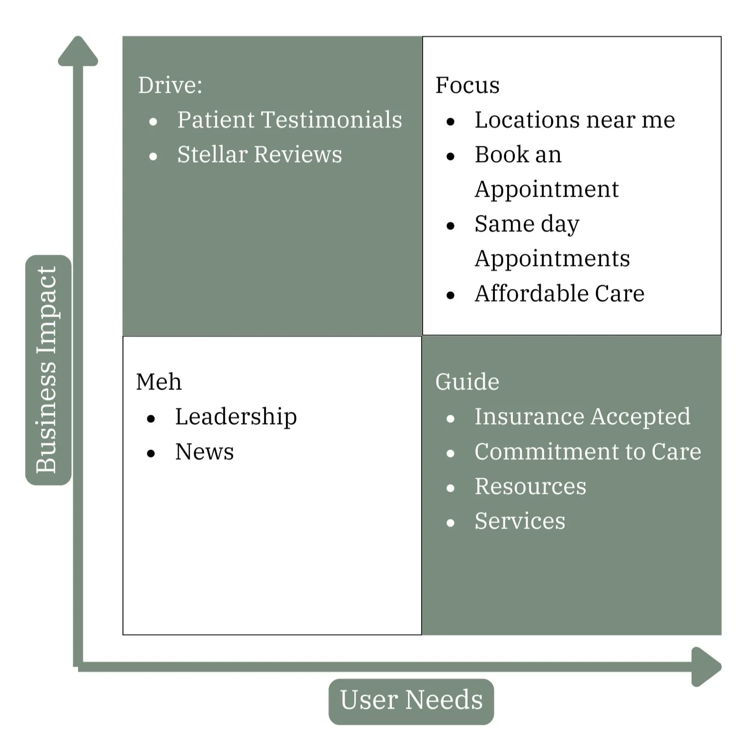
First, I created a 2x2 chart, stating user needs and business impact, determining what values are most important to showcase and what is not as necessary. According to The Content Strategy Toolkit Methods, Guidelines, and Templates for Getting Content Right by Meghan Casey, Four categories you should organize your content into are:
Focus: What content should the site focus on because it’s important for the business and its users?
Drive: What content drives people to because it wasn’t what they were looking for, but it’s beneficial for the business.
Guide: What content is needed to guide users forward because it’s important to them, but not all that beneficial to the business?
Meh: What content will probably be included because you feel like you have to, but it’s really not beneficial or important to anyone?
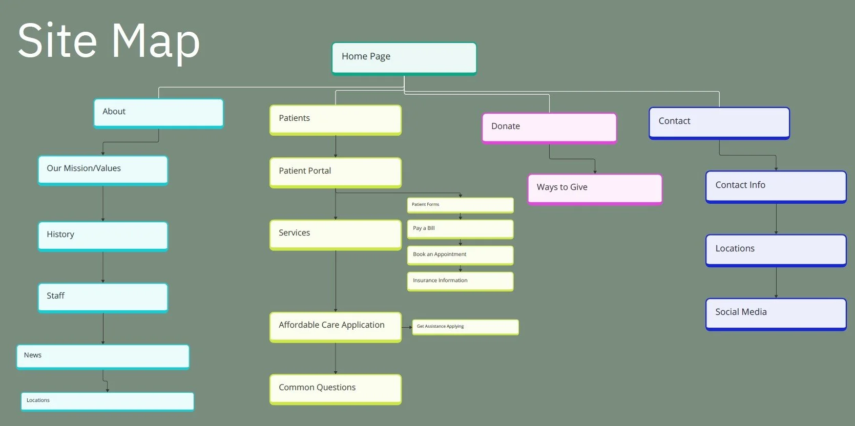
Sitemap diagrams are like organizational charts for your content. A sitemap visually demonstrates how the site is organized so that you can communicate the proposed structure to stakeholders and the people who will be building the website (Casey 2023). Sitemaps are useful for websites that have a traditional navigation menu/plan to implement one, but they are also useful for showing subpages of websites.
After a little bit of reorganization, I determined that HealthReach’s navigation menu can be reorganized to better showcase each menu item.

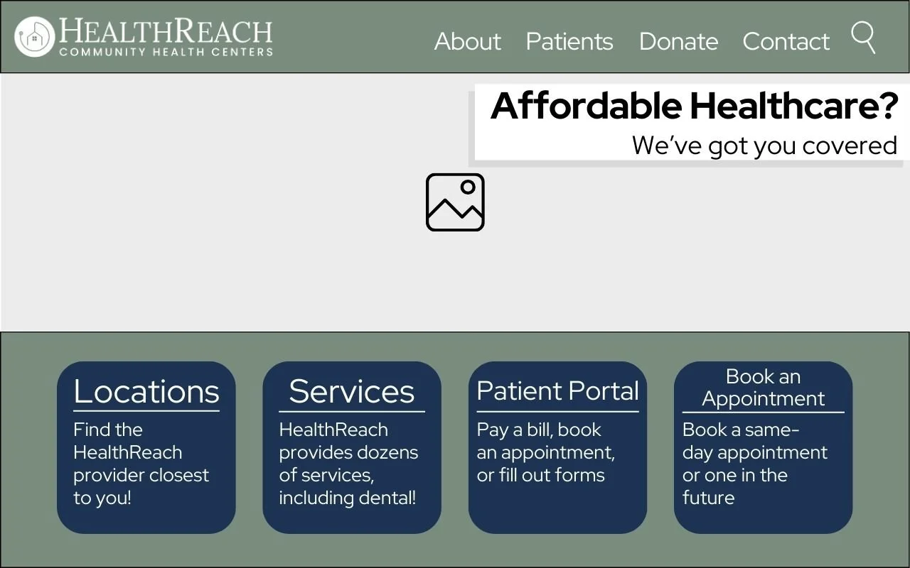
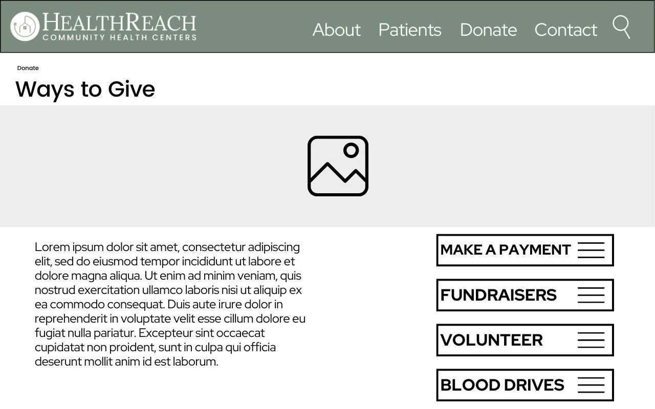
Finally, I curated wireframes to give HealthReach an idea of what their website may look like with all of my suggestions. In the UX process, wireframes are a crucial final step in designing a brand.

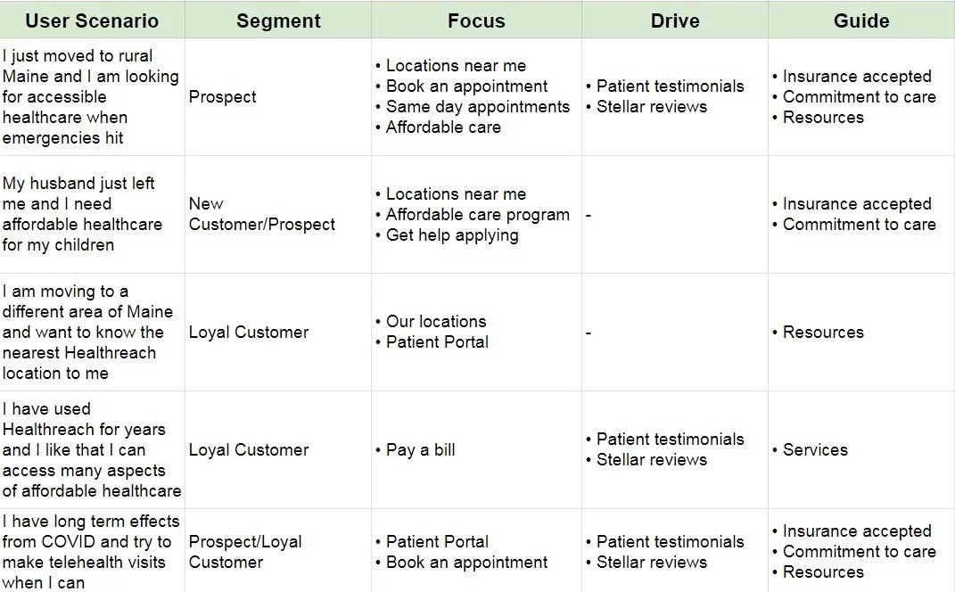
Using this chart as a baseline, I complied the information into different user scenarios, defining what type of content can assist the user. I made each scenario relevant to healthcare in the current day and age, taking the COVID effect into consideration along with the impact of the digital age.
To keep HealthReach’s brand consistent, I provided a style guide for fonts, colors, logos, and symbols. I also suggested a clear, concise, inclusive, and respectful tone of writing across their website.
HealthReach will keep six of it’s original colors while executing them in a more effective way. The main font that will be used across HealthReach’s pages is Red Hat Display, as it has a variety of options in bold, italic, and more. Buttons are used as easy navigation tools for users to quickly get to a webpage. All buttons will be the navy blue #1D3353 with white text. All icons on the website should be using the #1D3353 navy blue or #547DA6 light blue. Many of the current icons use a third blue, adding too many colors to the palette.